Smart organization
easier file management
Solo developing an AI-powered app to reduce organizational frustrations.

Role
Product designer, developer
Duration
8 weeks design (still ongoing)
Tools
Figma, Claude code, VS code, GitHub
Identified an opportunity to alleviate user frustration within the file management market. Solo built an AI-powered application that addressed this problem from zero to MVP with a vision to evolve into a fully built well-rounded product.
Problem validation
During initial research of the competitive landscape, both paid AI-powered products and open source self-serve GitHub repositories showed decent user interest in an automated solution that helps with file organization frustrations. With these finding, I went on to interview a handful of users to validate initial findings and uncover high impact frustrations.
These activities led me to the decision to build a MVP targeting cloud drives to quickly and easily validate the value proposition.
Strategy & Planning
MVP user flow
The ideation began with mapping out a MVP user flow with the intention to validate the perceived value of an AI-powered file organizational app and if it can reduce organizational frustrations.

Product roadmap
Flexible iterations and real user feedback validation cycles was the key goal of this early product roadmap, hence, the MVP was decided to be built as a browser extension based app.
Immediate:
Aim to rapidly ship MVP user flow to collect real user sentiments around AI assisted organizational workflows.
Near-term:
Quality of life enhancements, such as, organization history, rule engine, and RAG architecture.
Long-term:
Pivot to local system organization, and foundational security and privacy.
Design
Drawer component
The decision was made to utilize a drawer component that seamlessly embedded into Google Drive’s ecosystem. The rationale behind this decision was 1). avoid disrupting native user flows 2). clear visibility and ease of recognition.


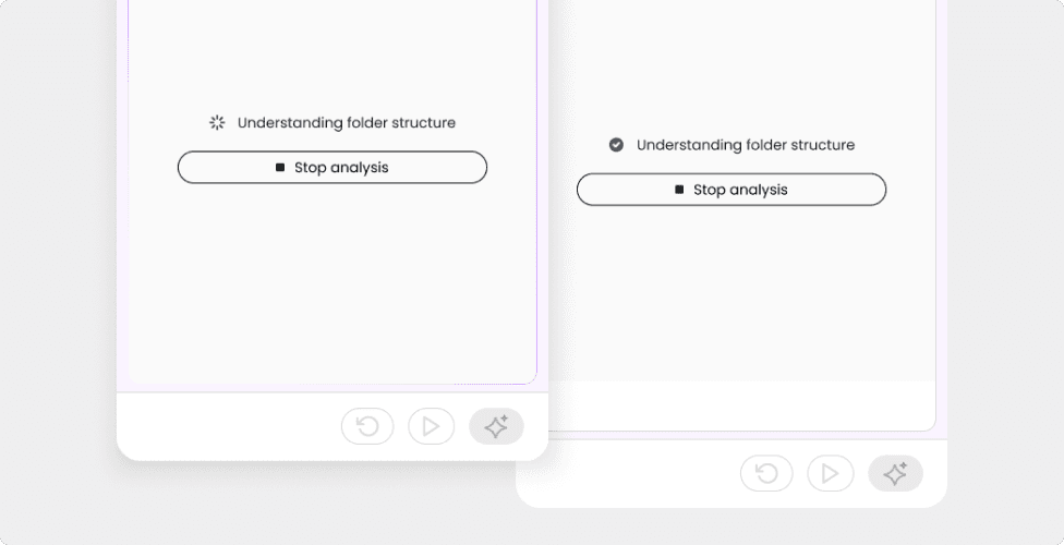
Streaming AI action and thought for transparency, clarity, and trust
In order to encourage exploration and ultimately drive adoption, the actions and thought process of AI needed to be moderated and validated by the users to build a trusting relation.
Streamed AI action and thinking states
Every AI decision making process was paired with a state description to increase transparency, and build up the foundations of the trusting relation.
Compact and clear actions
Limited real-estate was a limitation with the drawer component choice, hence, key actions were designed to be compact in it’s default state with only icons, and provide clarity during hover states.
In addition, the compact approach was also intentional to allow for the possibility of growing future actions.
Compact default state
Minimized button size to fit necessary actions while still progressively disclosing button function through hover states.

Designed for growth
The compact button design gave us the flexibility to expand and add additional functions when the tool grew in features.

Action oriented results
While designing and running research in parallel, we observed that the suggested organization actions could be categorized into two mental models 1). moving and 2). creating. The delineation between the two actions elevates clarity and helps users easily identify 1). what is just being moved and 2). what is being created and then moved.
This observation guided the design to progressively disclose suggested actions grouped into these two categories, rather than just displaying a long list of suggested actions.
List view (before)


Final polish

Development
AI coding toolkit leveraged
Created a framework leveraging Claude code + VS code + GitHub for development work, that not only allowed me to ship production ready code and elevated my coding knowledge.
The framework modeled an agentic work stream where multiple role specific agents operated within their confined rules and was orchestrated by a master agent to adhere to established protocols.


