Enhanced guidance for improved support
Increasing user confidence and adoption for the manager evaluation process.
Role
Product designer
Team
Product manager,
program manager,
enablement, comms
Duration
5 weeks
Tools
Figma, HTML, CSS, WalkMe
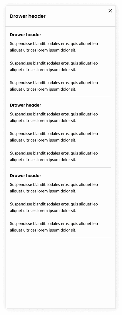
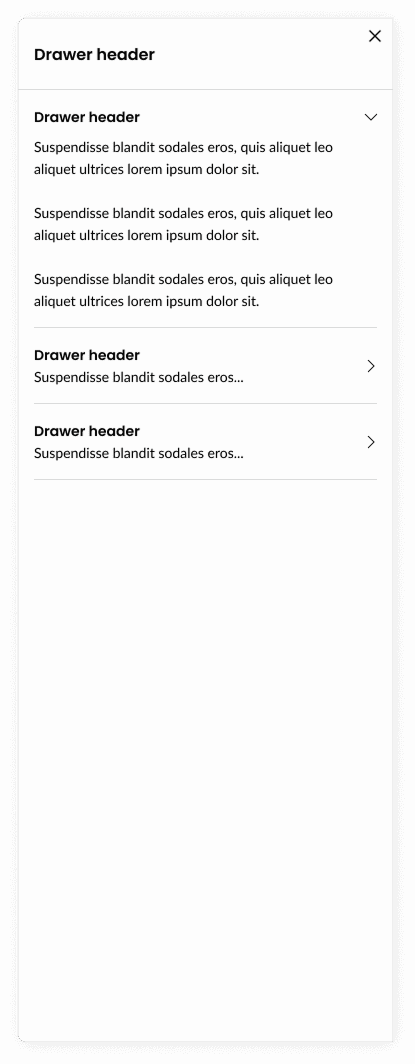
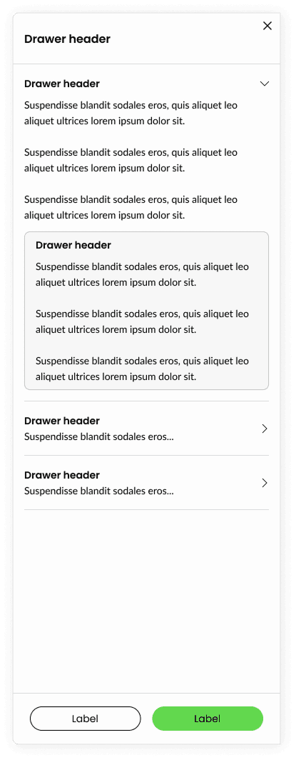
Our people manager’s were experiencing a challenge to recollect training material while evaluating employee performance. Leading to frustrations and low adoption to our Workday system and business process. This led to the development of a series of drawers, aimed to house relevant training materials that heavily influenced the manager’s in making the correct evaluation that ultimately influenced the increase of our eSAT score.
Impact
Our goal with the shipped project was aimed to influence the increase of our eSAT score and increase business process knowledge. Our leadership believe that we exceeded expectations by influencing the increase of our eSAT score by 4pts raising our eSAT score to 81%.
In addition, usage rate of our drawers were measured at 15%, which was a 10% increase compared to our legacy solution.
15%
increased
user usage
+4pt
eSAT increase relative to previous cycle
5
positive anecdotal mentions
The challenge
Swivel chair enablement
Training material and guidance were housed in disparate systems or only through virtual instructor led training.
The challenges managers experienced were they needed to shuffle between systems, personal notes, and recollection of training to confidently evaluate performance in the Workday tool.
This frustrating experience led to lower than expected eSAT scores and adoption rate of the tool and process.

Tool tip overload
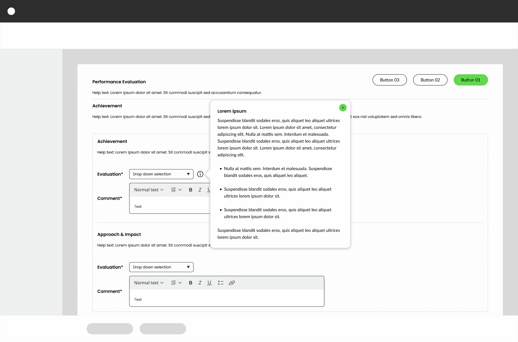
The legacy experience was sprinkling 8 tool tips with overwhelming amounts of content, and on top of that, the content was not structured in a manner that easily allowed users to scan through easily.
In addition, the usage data showed that these tool tips were only used by less than 5% of the user population.
Legacy (replaced) experience
The following example is a redacted re-representation of the replaced tool tip experience.


